UX/UI Designer & Front-End Developer
KRYSTEXXA Infusion Facts
Project Summary
Challenge
The KRYSTEXXA team needed a way to educate patients with uncontrolled gout and those around them of ways to manage their condition in their every day lives.
Objective
Create a simple yet informative and easy to navigate page that provides a plan for how to manage uncontrolled gout. This new page would efficiently organize and display all the resources, assets and suggestions that the KRYSTEXXA team had available.
Tools
Sketch
XD
Crownpeak
Timeframe
5 months
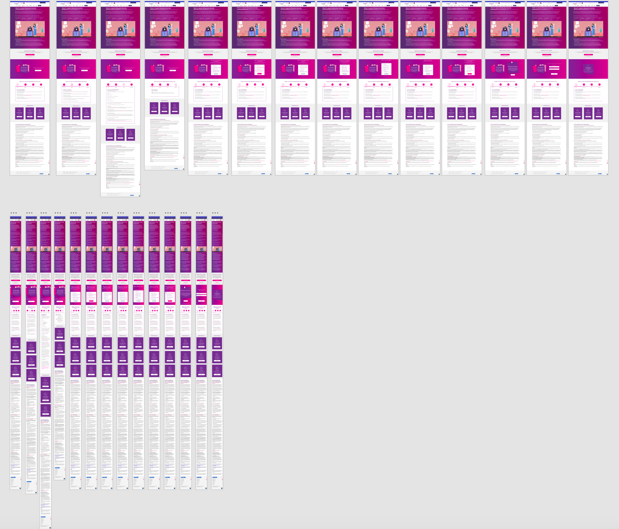
After understanding and analyzing the requirements, I conceptualized
5 design variations exploring content layout, interactions, and user expectations.
Concept 1
Concept 2
Concept 5
Concept 3
Concept 4
After reviews with the client and the development team,
we moved forward with concept #5.
This concept:
provided the best end-to-end experience as it layouts the content in the simplest and most organized manner such as the treatment of the video progression.
provided the most intuitive and visible interactions.
It was the most feasible as it only required the use of existing component capabilities.
It was the quickest to achieve as it required the least customization
I iterated this concept two times based on qualitative and quantitive feedback received from 2 rounds of testing. Also, the UI was enhanced a bit while still staying in sync with the brand guidelines for the KRYSTEXXA site.
The final design consisted of the following pieces below.
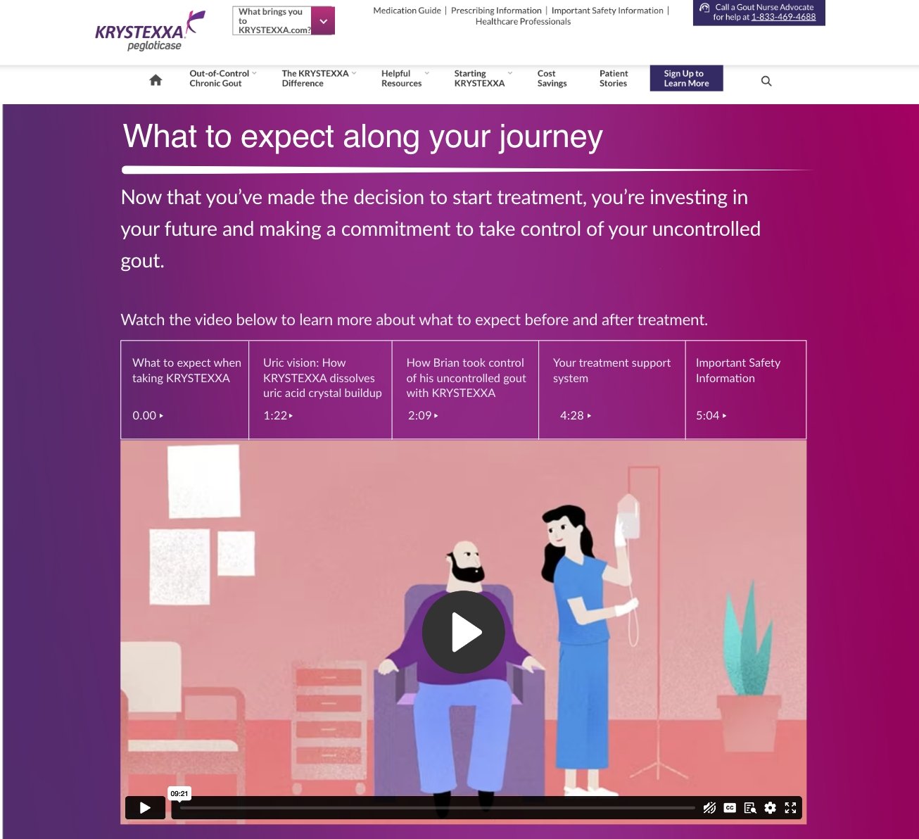
A Video with Chapters
A 10-minute video was made easy to navigate with the main sections identified in chapters and placed on top of the video frame. Visual cues and simple interactions such as timestamps and hover effect were also added to help identify relevant segments and find placement in the timeline faster.
Additionally, the main takeaways of the videos were highlighted in bullets to help the user digest and remember the main content effortlessly.
I accounted for the different scenarios that a patient may be interested in when reaching this page as shown in the picture on the left and each explained on the right.
Mindful CTAs
Draft Email Now can be edited and sent to an employer or a coworker at that exact time.
The patient can email the template to themself directly on the page and access it on any device at any time.
A PDF version is also available for download so the patient can have the information on his/her device for later use.
A Simple Visual of a Plan
I broke down the journey into 12 steps and 4 stages for patients to guide patients through their process in a manageable way. Each of the four stages addresses different aspects of the journey, ensuring that recommendations are clear and actionable. This structured approach allows patients to proceed step-by-step, ensuring a more comfortable and effective experience.
Step 1
Step 3
Clear and Accessible CTAs
The remaining set of resources available were clearly sectioned for quick access at the bottom of the page. This layout enhances user experience by clearly organizing resources, allowing patients to quickly find answers. This structure promotes understanding, encouraging patients to learn more and make informed decisions.
Due to the acquisition of Horizon Therapeutics and the stage of development at that time, this page could not be launched as scheduled.
If you would like more details or
see these wires more closely, please feel free to reach out.


